
Every year the eBird Status and Trends project updates the abundance visualizations and range maps with millions of new observations submitted by eBirders to provide the most up-to-date information on the status and trends of bird populations. This year, the team modeled relative abundance for 868 additional species—doubling the number of species with available abundance visualizations! Now abundance visualizations are available for 2,068 species across the globe using data from 464,542 eBirders.
What’s new for eBird Status Visualizations in 2022
- Global relative abundance and range maps for 2,068 species—a 72% increase in available species
- eBirders filled in data gaps
- 43.8 million eBird checklists—a 21% increase in number of checklists
- 464,542 eBirders contributed data—a 24% increase from last year
- 187,119 eBirders contributed data for 10 species or fewer, suggesting that new or casual eBirders play a big role in understanding relative abundance of birds across the globe.
- eBird Status visualizations include data from 2007-2021
eBird Status visualization highlights
With more than 2,000 status visualizations it can be hard to know where to start. Here are a few of our favorite examples to illustrate the impressive insight into bird populations that eBird Status and Trends maps provide. Share what you’ve discovered on social media using #eBirdScience.
Wood Warbler
The Wood Warbler breeds in woodlands across much of Europe and winters across central Africa mainly from Sierra Leone to Cameroon and Gabon. For species like the Wood Warbler that have an expansive distribution, being able to visualize the extent of their movements is eye-opening. The new weekly abundance visualizations show a cool cyclical migration pattern, with birds traveling south to their wintering grounds through eastern Africa and traveling north to their breeding grounds through central and western Africa. While data gaps (the light gray areas in the weekly abundance visualizations) still exist in parts of their range, we are getting a much better picture of the population thanks to eBirders.
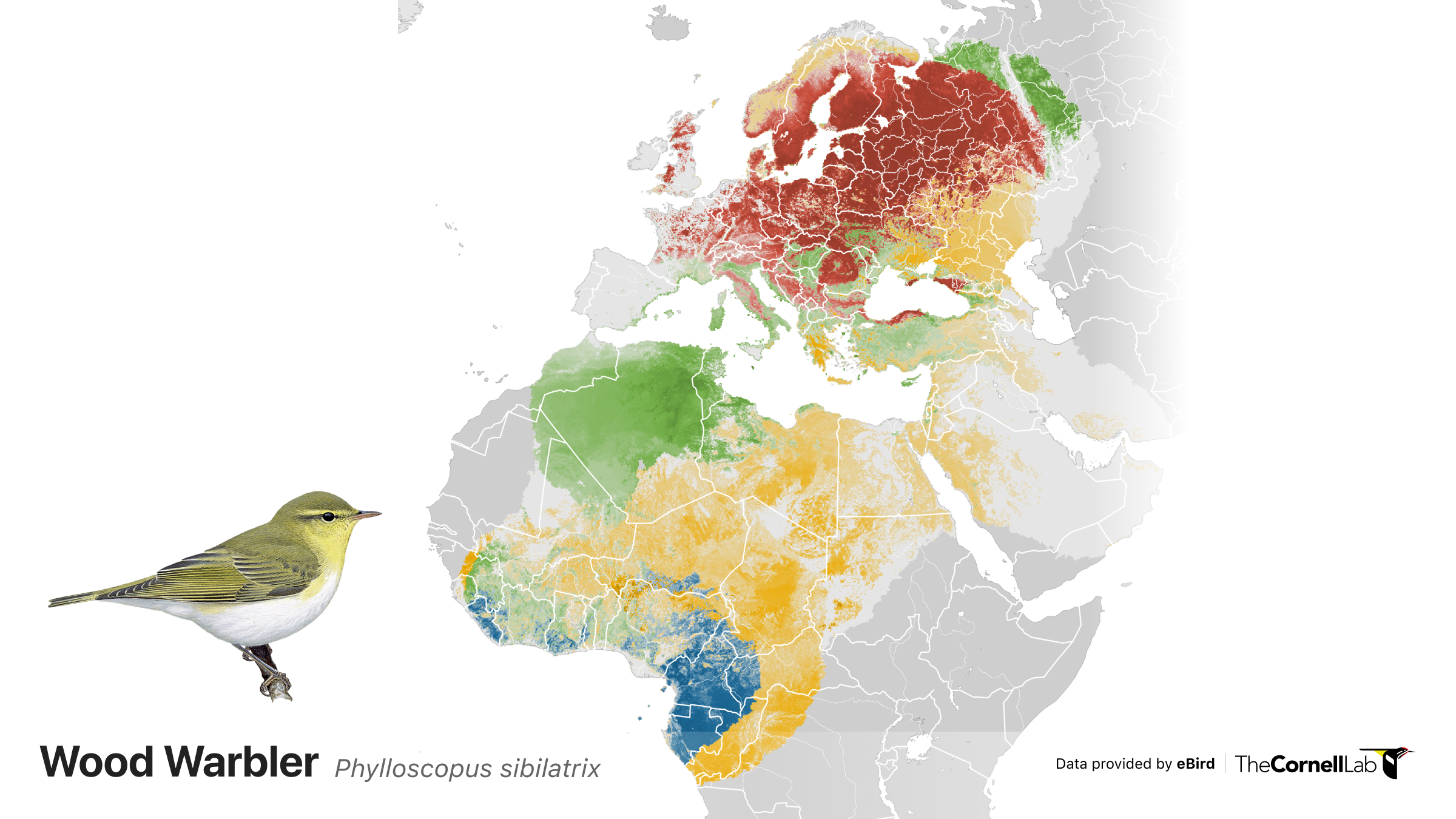
Relative abundance of Wood Warbler depicted for each season along a color gradient from a light color indicating lower relative abundance to a dark color indicating a higher relative abundance. Red indicates the breeding season, yellow indicates the post-breeding migration season, blue indicates the nonbreeding season, and green indicates the pre-breeding migratory season.
Welcome Swallow
eBird checklists submissions in Australia and New Zealand grew by 14% and 26% respectively from 2020 to 2021, which means that more species in Australia and New Zealand have enough data in eBird to allow the team to estimate relative abundance throughout the year. The Welcome Swallow is one species that now has enough observations in eBird for us to see migration pathways and centers of population abundance in incredible detail.
Compare the eBird Status distributions of the Welcome Swallow modeled from checklists submitted by eBirders below to a traditional range map. The Status & Trends abundance map reveals fine-scale abundance patterns and more accurately depicts this species’ habitat affiliation with open country, coasts, cultivation and human habitations as described in Birds of the World.
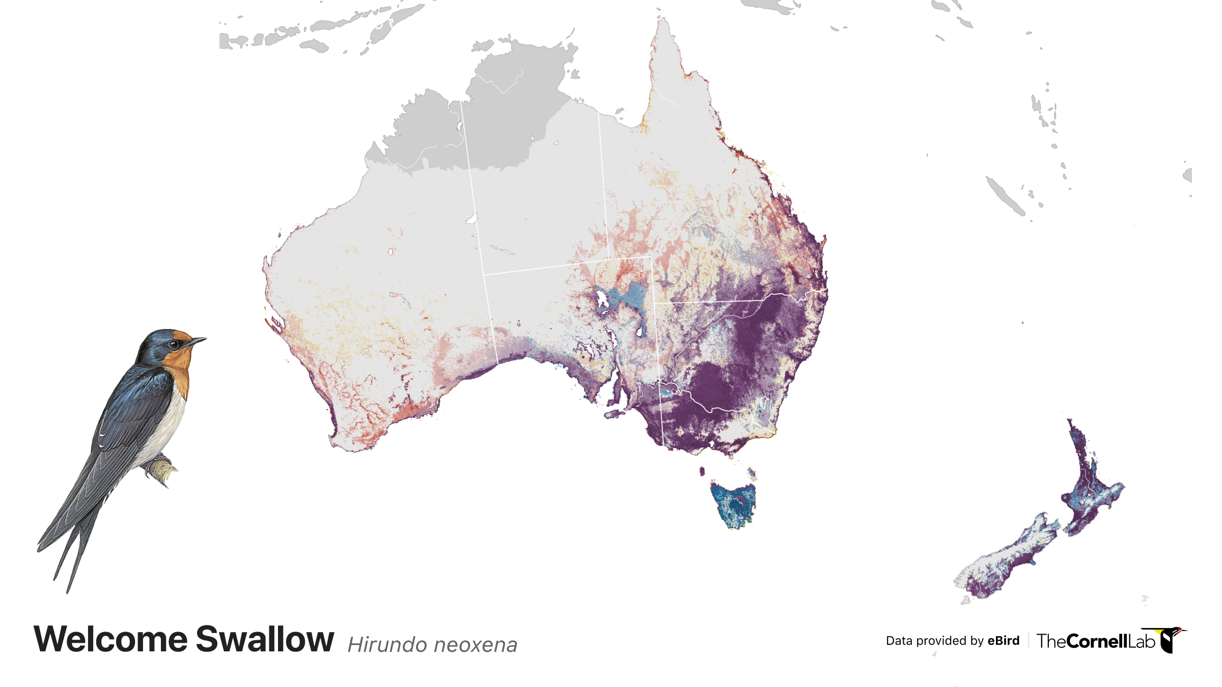
Relative abundance of the Welcome Swallow is depicted for every week of the year along a color gradient from a light color indicating lower relative abundance to a dark color indicating a higher relative abundance. Purple indicted year-round occurrence, red indicates the breeding season, blue indicates the nonbreeding season, yellow indicates the pre- and post-breeding migratory season.
Syrian Woodpecker
eBird Status visualizations often support scientific findings and the Syrian Woodpecker is one example. Several studies reported in Birds of the World suggest that Syrian Woodpeckers have expanded their range northwards in recent years, possibly aided by agricultural development and other human activities. Colonizing birds are thought to “jump” from one city park or agricultural plantation to another, often appearing long distances from the nearest source population.
The eBird Status abundance map bears that out, showing Syrian Woodpeckers in the northernmost portion of their range tend to be clustered around urban centers. The eBird abundance model for Syrian Woodpecker provides a useful visualization of the “scattered” colonization behavior described by researchers.
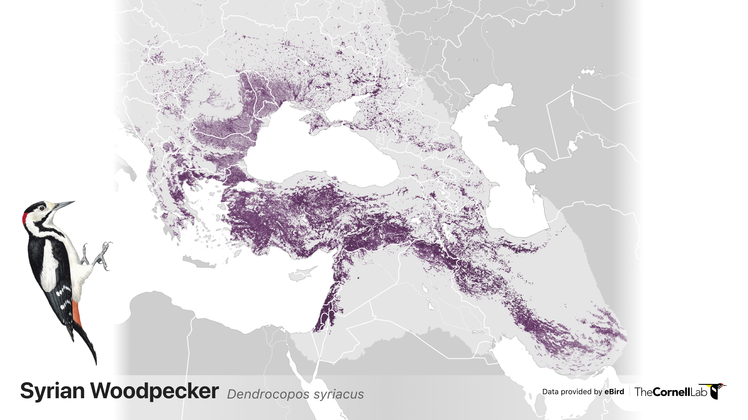
Relative abundance the Syrian Woodpecker depicted year-round along a color gradient from a light color indicating lower relative abundance to a dark color indicating a higher relative abundance.
Powered by eBirders
Every checklist you submit allows the eBird Status and Trends team to refine and expand status and trends for more species, more regions, and with more precision. Thank you for sharing your sightings with eBird—together we are creating a better understanding of birds around the world. Visit our help center to get tips on how to make your checklists count for science.
Request Status and Trends Data Products for research and conservation
Status and Trends Data Products featuring an updated dataset for 2021 can now be directly downloaded from your web browser. Get weekly or seasonal abundance and range boundary data by clicking ‘Downloads’ in the upper right on any S&T page. Some Data Products require an access key that is tied to your eBird username, which you can get by reading and agreeing to our eBird Products Terms of Use. Our Data Products can also now easily be added to your favorite mapping software, no need to use our R package.